
Crazy Cryptids
Environmental Graphic Design / Illustration / Branding
Crazy Cryptids is an environmental graphic design project that utilizes branding I created based off of urban legends also known as “cryptids.” Guests will find themselves on a wild ride as they explore the various places that these creatures inhabit.
Part 1: Creating the Creatures
Moodboard, Sketching, Final Characters, Wordmark, Final Design Guide
Moodboard and Inspiration
Family coasters, typically those targeted towards children, have a bright and friendly design language to them. I drew inspiration from many different “mouse coasters.”

Sketching the Characters
After researching the most well known urban legends, I settled on the bigfoot, loch ness monster, mothman, and yeti to be my main cast of characters.

Final Characters
The final creatures featuring soft colors and simple design. Each character is unique, allowing for guests to connect with.
SASQUATCH
YETI
LOCH NESS MONSTER
MOTHMAN
Wordmark Iterations
When desigining the wordmark I wanted to create something that would match the rustic cryptid concept and excite riders. I then implemented the colors from the characters into the letterforms.

Final Design Guidelines

Part 2: Environmental Applications
Entrance Sign, Queue Signage, Ride Vehicles
Installation Graphic Guide
A spreadsheet outlining the materials, sizing, and placement of each graphic that would help guide the installation crew.

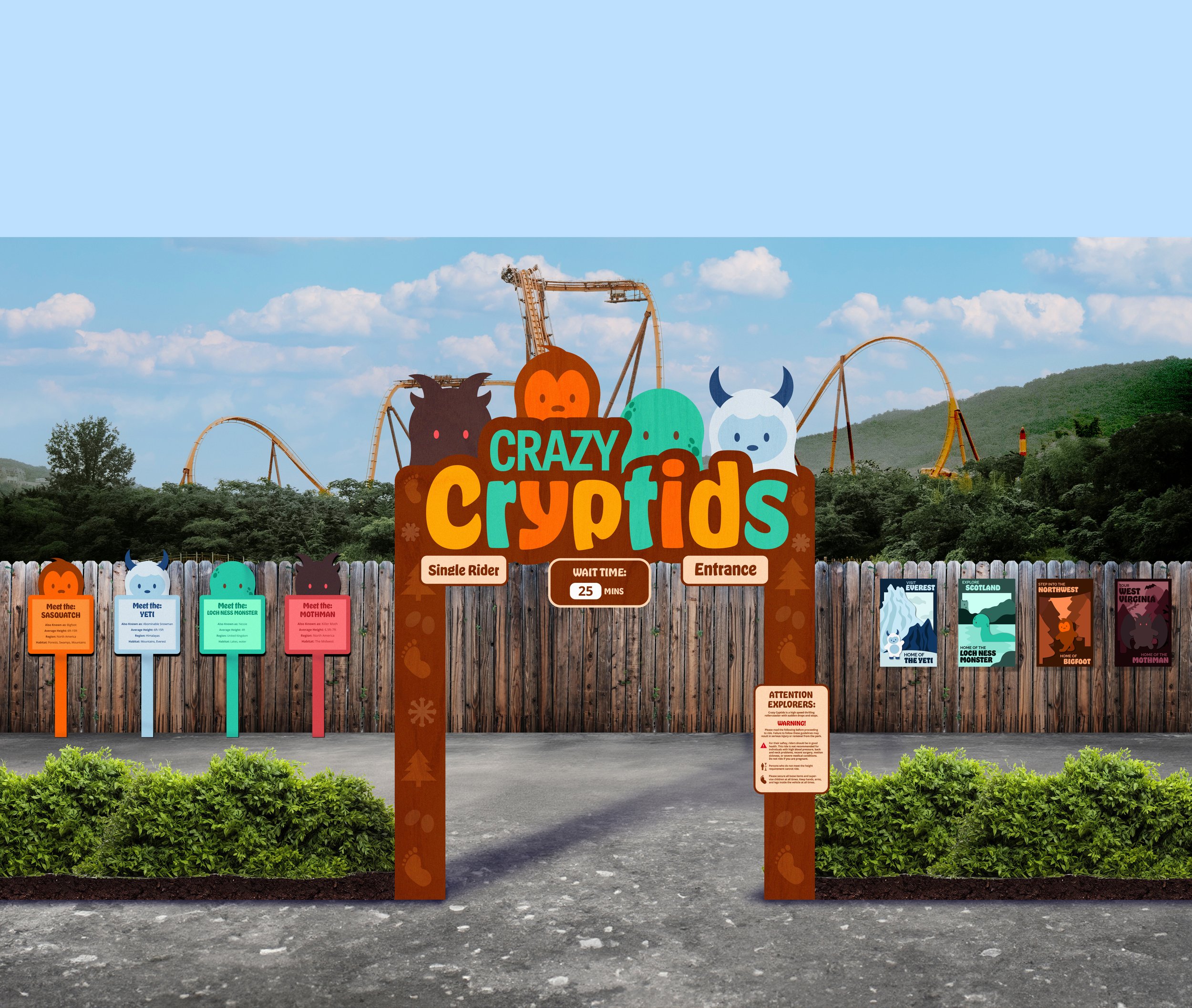
Entrance Sign Details
A closer up view of the signs featured on the main entrance elevation. These signs provide information about the ride and wayfinding for the guests before riding. This sign would be HDPE.

Full Entrance Sign
The entrance sign features the four creatures (HDPE) placed behind the wordmark. The sign includes four main components of information: single rider, wait time, entrance, and a warning sign. In addition, there are symbols representing each creature down each leg of the sign which would be printed on plywood.

Queue Signage
As riders wait in line, they can learn more about the creatures that are featured within the ride. Each character being unique allows for riders to connect with a specific one. These signs would be about 4 ft tall and be made of HDPE for durability.

Queue Signage


Each creature is featured in a poster in their respective habitats and environments. These would be featured in a section of the queue line to give riders more of a visual of the lands they are “exploring” throughout the ride.


Queue Signage “Tour Map”
A “tour map” will be placed near the loading station to give riders an idea of each area that the creatures occupy within the space.

Floor Decals
These decals would represent the row numbers for boarding the ride vehicles. The numbers will not only help guide guests, but also include the theming.

Ride Vehicles
Each ride vehicle features the four characters. This increases returnability since guests can board one of four different vehicles each time which are selected randomly.


